The advances made by humans in both advanced statistical calculations and data visualization techniques have been extraordinary over the past few decades. The turning point, which inclined the scale in favor of data visualization, came in 1973 when a commonly believed myth was discarded by a brilliant and intuitive man.
In 1973, Francis J. Anscombe published a paper titles “Graphs in Statistical Analysis.” Up until this paper was published, it was a common belief that:
“Numerical calculations are exact, but graphs are rough”
Changing the opinion about something so deeply rooted in the mind is highly commendable. Let’s look at how he achieved this feat!
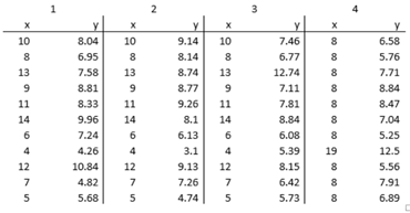
He let the numbers speak for their weakness themselves! A brilliant strategy I must say. He came up with the table above. I’d encourage you to spend a minute to analyse the 4 different datasets before scrolling down.
.
.
.
.
.
.
.
.
.
.
.
.
.
.
.
.
.
.
.
.
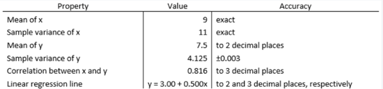
At first glance, it is quite difficult to draw any meaningful conclusions. So, we then turn to our good old friend Numbers. This was come as a bit of a shock and we would feel dumb for not noticing it before but notice that the statistical indicators say that the 4 samples are exactly the same.
However, the less popular kid, ie. Graphing, hums a different rhythm. Take a look at the following graphs which represent the same datasets as above.
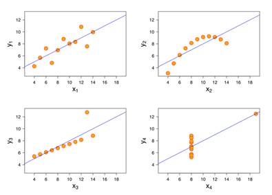
Holy Lord! Leave same aside, they’re not even similar to each other!!
If this doesn’t break your confidence in the statistics you’ve used thousands of times to draw conclusions since your high school, then I don’t know what will. This betrayal hurts damn good ☹.
So, what really happened here? Let’s start by observing the data sets:
- Dataset 1 has a well-fitted regression model, way better than others
- Dataset 2 is not normally distributed and doesn’t have a linear correlation
- Dataset 3 has linear correlation, but the regression is hampered by an outlier
- Dataset 4 is tightly woven but just one outlier is enough to produce high correlation coefficient
THE BIG REVALATION
Fundamentally, using statistics, we try to represent hundreds and thousands of numbers using a single number. We would be fools to expect one single number to hold as much information as the entire dataset does. Certain information is disregarded and only a small fraction of the information is portrayed by the summary statistics.
This is not just a problem when compressing a large dataset to summary statistics. This is evident as Anscombe used just 11 pairs and was still faced with the same issues.
Yes, numbers are vey outspoken and have a strong voice. But it is important to not be blindsighted by its beauty and focus on the introvert sitting in the class as well called data visualization.
P.S. If you find this interesting then check out the Datasaurus Dozen by Autodesk Research.

One thought